Adopt, don't scroll
Designing a centralized, trust-forward pet adoption mobile app for users overwhelmed by a fragmented landscape.

Adopt, Don't Scroll is a 7-day UX design challenge to create a mobile app helping first-time pet adopters find animals across multiple verified shelters and rescues in one place. Working solo from problem to prototype, I grounded every design decision in user research - developing a persona, mapping a full task flow, and iterating through paper wireframes before building a lo-fi prototype in Figma.
Overview
MY ROLE:
UX Designer (Solo)
METHODS:
Persona · Task Flow · Wireframing · Lo-fi Prototype
TOOLS:
Figma · Lucidchart · Paper
TIMELINE
Jan 30 - Feb 6, 2026
SECTION 1
PROBLEM
The pet adoption landscape is overwhelming - and fragmented.
When I started this challenge, I did what any user would do: Googled "dog adoption near me." Twenty websites loaded. Different organizations, different formats, no way to know which were legitimate.
There were dozens of different websites, each with their own pets to browse through. I didn't know where to start or which sites were even legitimate.
That experience was the research. The solution wasn't another shelter website - it was a centralized platform that aggregates listings, builds trust, and gets out of the user's way.
Primary Goal:
Search for adoptable pets across multiple legitimate adoption agencies/shelters in one place, without having to visit a dozen websites.
what this project means to me

My family adopted Marvin when I was 12 and he changed our lives. I believe in adoption because it gives animals a second chance while strengthening our communities. This project immediately stood out to me because more pets deserve homes, and I want to make the adoption process more straightforward.
SECTION 2
RESEARCH
Understanding the user
Before any design decisions were made, I grounded the work in user understanding. I developed a persona, identified core user needs, defined research questions, and documented key constraints and assumptions - all before a single screen was sketched.

Alex, the overwhelmed first-time adopter
"What if my perfect dog is on a site I didn't look at?"
Alex is a 31-year-old woman who recently settled into a stable living situation and finally feels ready to adopt a dog - but she's paralyzed by choice. She's Googled "dog adoption near me" and been met with 20+ different websites, each with their own listings and no clear way to know which organizations are legitimate. The last thing she wants is to waste time creating accounts on ten different platforms just to browse.
01
Centralized search
See pets from multiple sources at once
02
Trust indicators
Know which organizations are reputable
03
Efficient filtering
Search by breed, age, location across all sources
04
Source transparency
Clear path to contact the specific organization
SECTION 3
design process
Task flow - Mapping the journey before sketching a single screen
Before opening Figma, I mapped the full user flow in Lucidchart - every decision point, every branching path. The annotations below highlight the five design decisions that were baked into the structure from the start.
Key Design Decisions
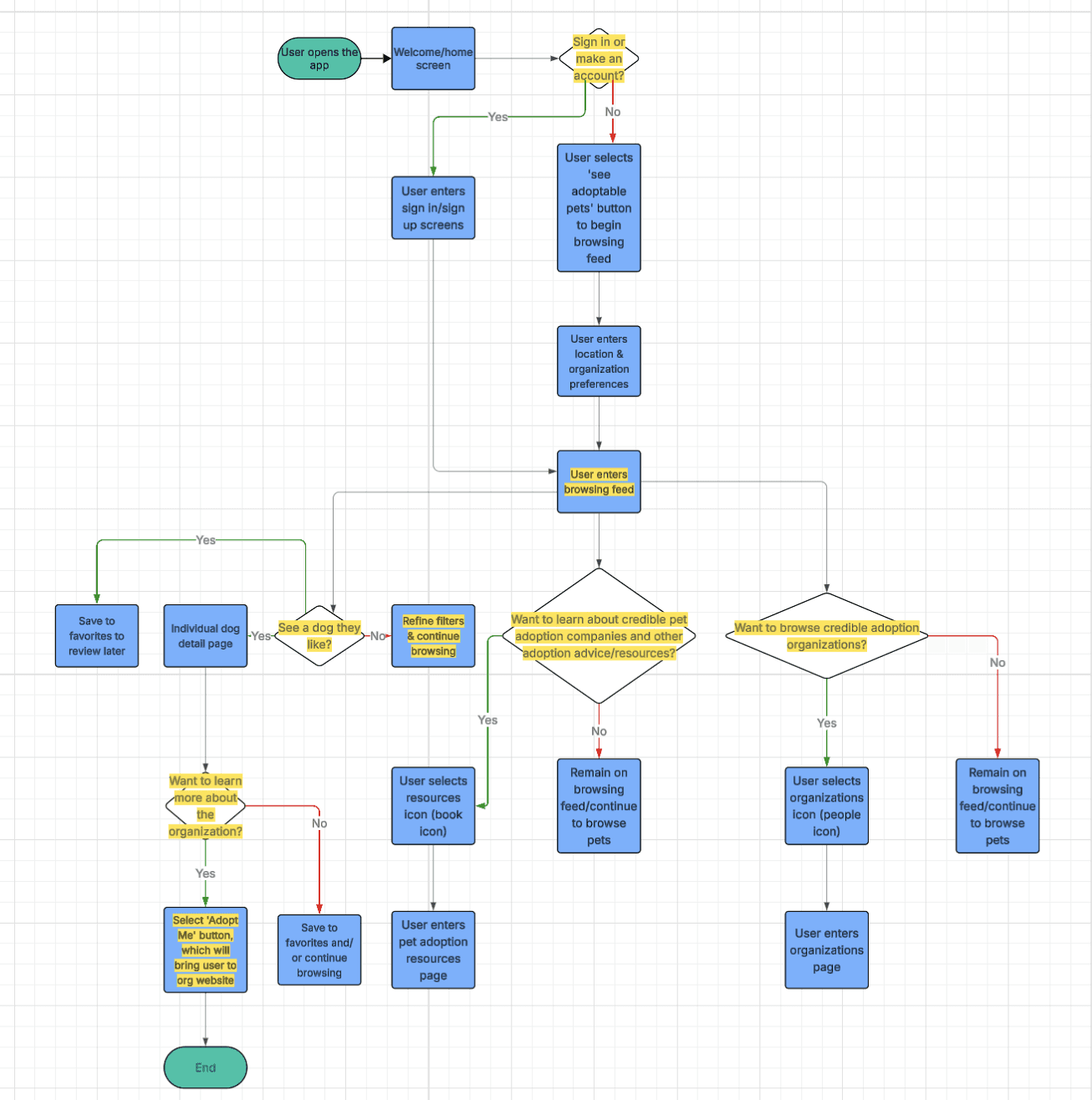
Low barrier entry
Users can browse immediately without creating an account. Reducing friction at entry was deliberate - users shouldn't have to commit to browse pets.
Centralized feed
The browse feed pulls from multiple rescues and shelters simultaneously. One place instead of twenty - this is the core value proposition of the app.
User-controlled filtering
Users can filter by pet type, breed, age, size, and organization type at any point. The feed responds to their preferences, not the other way around.
Integrated education
First-time adopters often don't know what makes an organization legitimate. The resources section was created to build trust as part of the experience.
Clear path to action
The "Adopt Me" button takes users directly to the organization's website to begin the process. No middleman, no ambiguity about next steps - the app is a discovery tool, and it hands off cleanly.
Paper Wireframes
Explored 3–4 layout options per screen, documenting the rationale for every decision made:

WELCOME/HOME SCREEN
I explored three different home screen layouts and selected the third design for the following reasons:
Two equally prominent buttons give users control over their path (browse vs sign in) · Larger, more accessible buttons improve usability
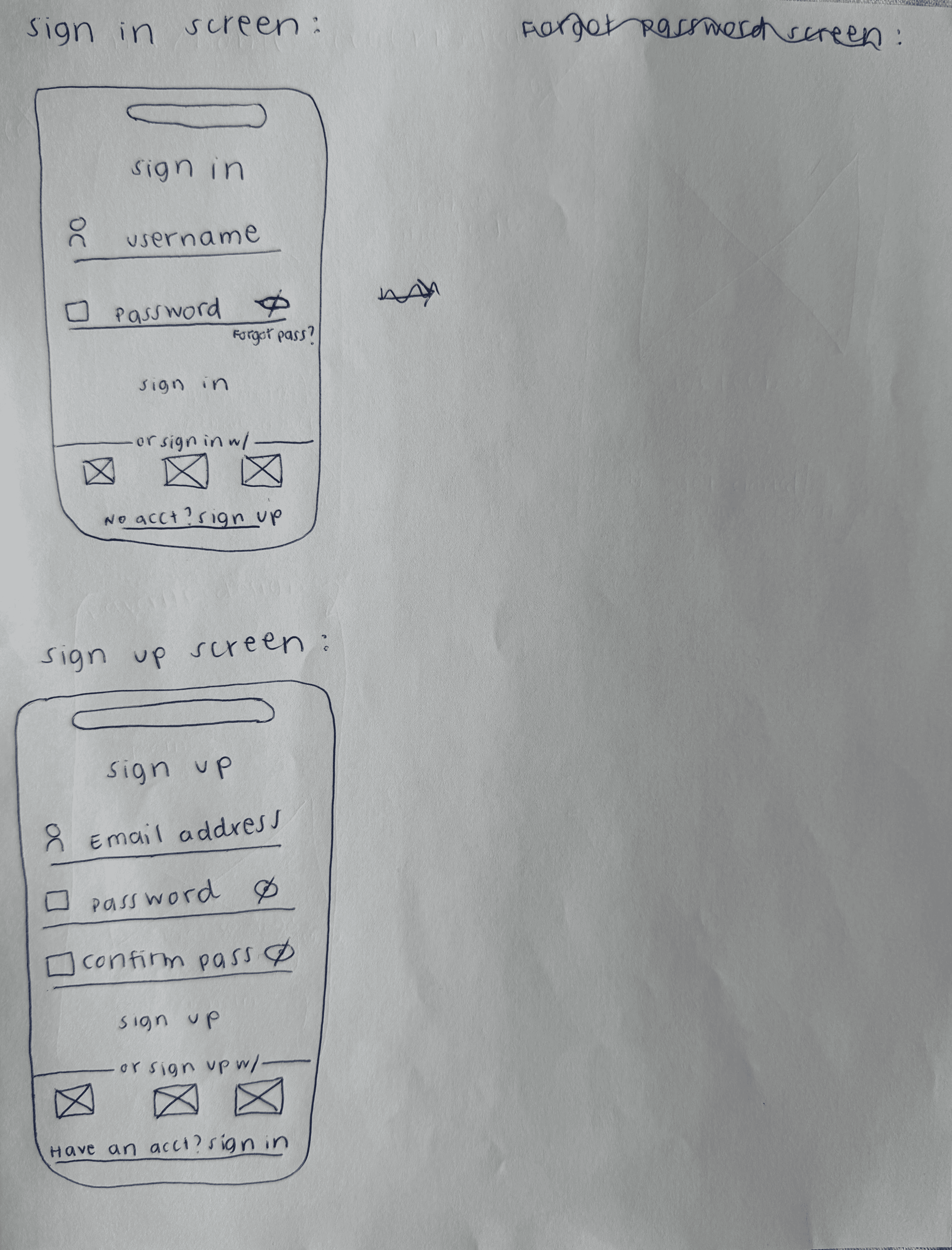
SIGN IN/SIGN UP SCREENS
I sketched standard sign-in and sign-up flows with:
Simple form fields (username/email, password) · Social sign-in/sign-up options for convenience · “Have an account? Sign in/Sign up” links for easy switching
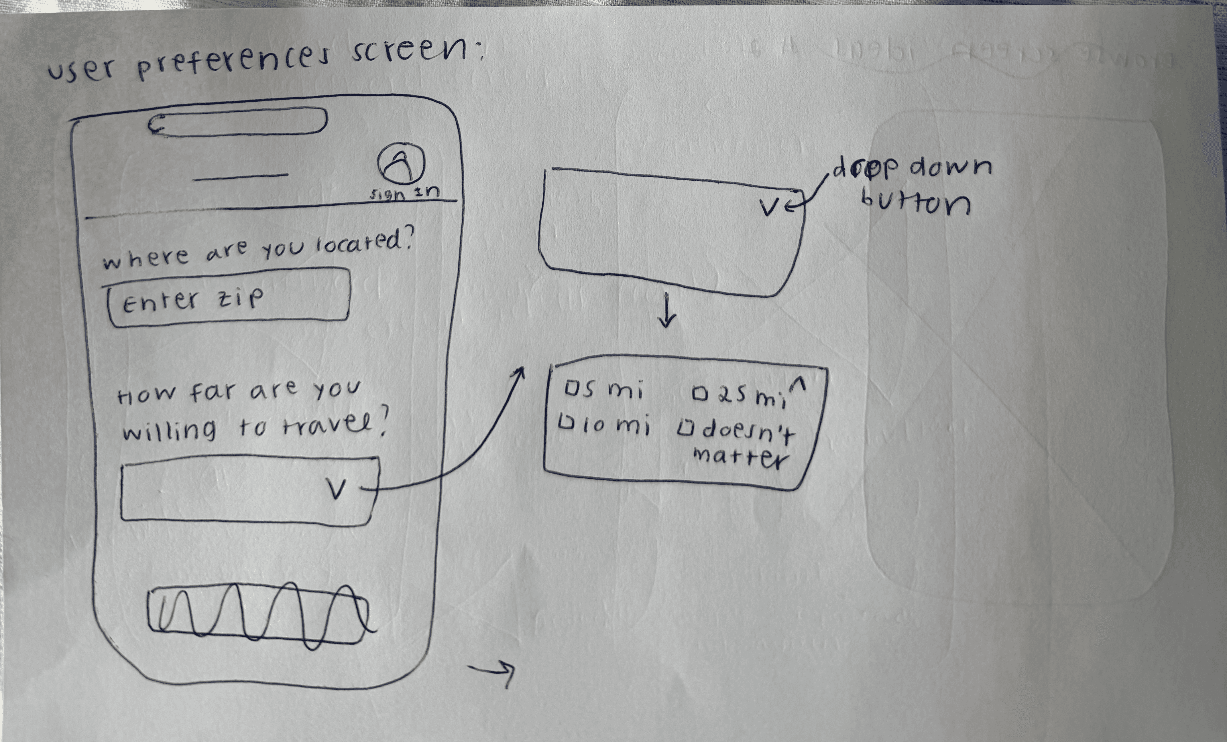
USER PREFERENCE SCREEN
My first sketch asked: “How far would you travel?” in second drop down option as seen on the right. In my low fidelity prototype, I changed it to: “What types of organizations do you prefer?” Why I changed it:
Connects back to app’s main goal: searching multiple adoption sources · Lets users choose shelter, rescue, or foster networks (or combination of them) · Reminds users that the app searches across different adoption organizations

BROWSE SCREEN
I explored four different browse screens and selected Design #4 because:
Smaller cards show more pets per screen without scrolling· Users can quickly scan and compare multiple options · Large photos aren’t necessary - when users tap ‘Learn More’ button, the individual pet page shows full-size images · Bottom navigation established in this design: Favorites, Resources, Browse Organization
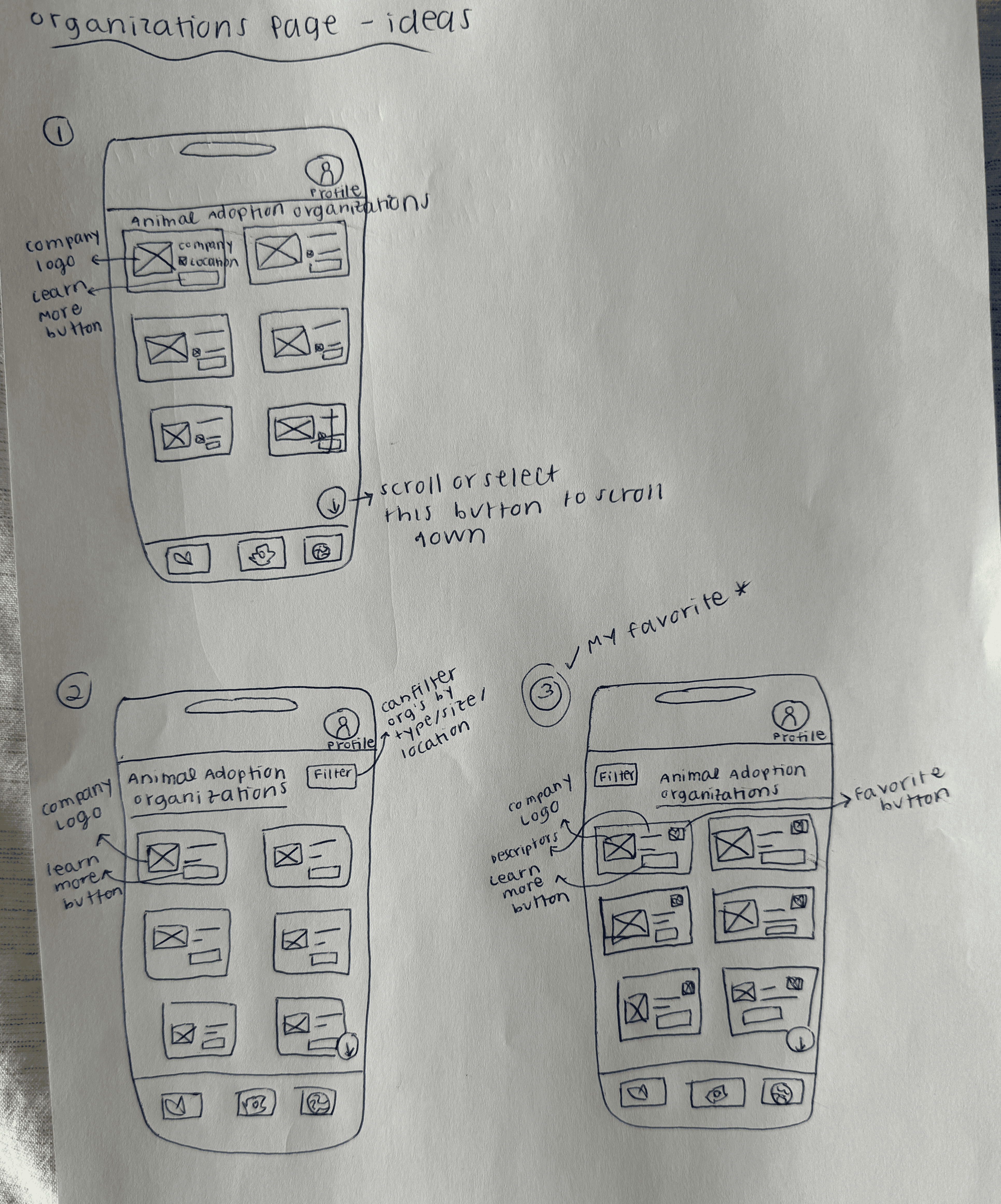
ORGANIZATIONS PAGE
I explored three layouts, and selected Design #3:
Added favorites button (users can save and compare orgs, just like with the pets) · Consistent with browse feed design (familiar pattern) · Users can revisit favorited organizations when deciding
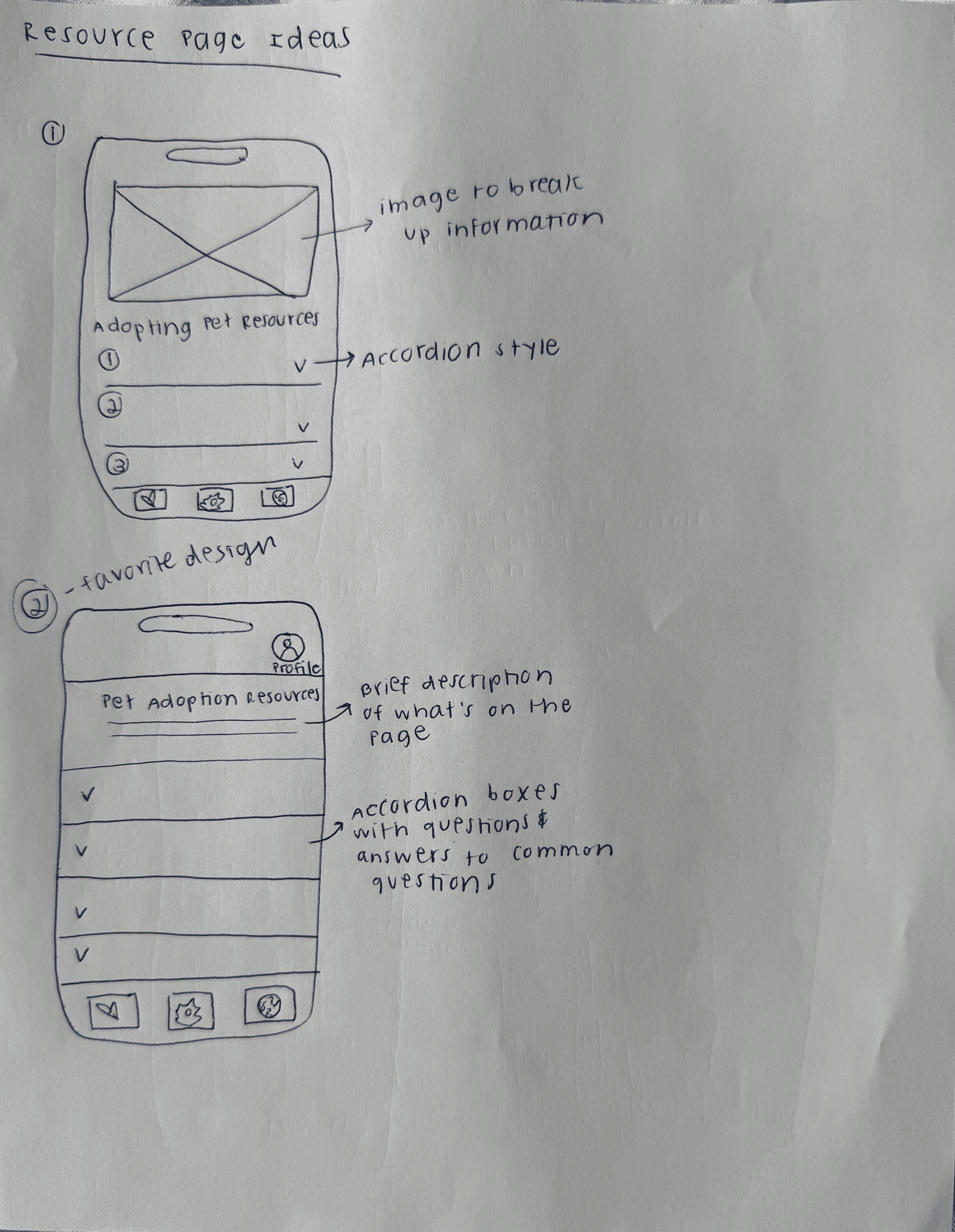
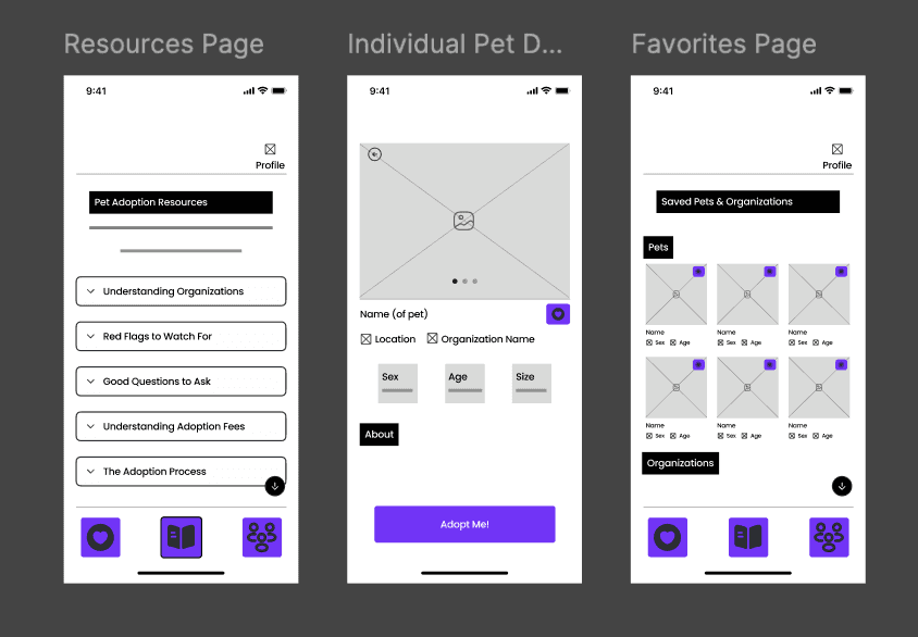
RESOURCE PAGE
Selected Design #2 over Design #1 because it removed the header image and focused directly on the content. I also selected accordion style because:
Content is hidden until clicked, which prevents from information overload · Users can control what they read (not forced to scroll through everything) · Clean, scannable list of topics
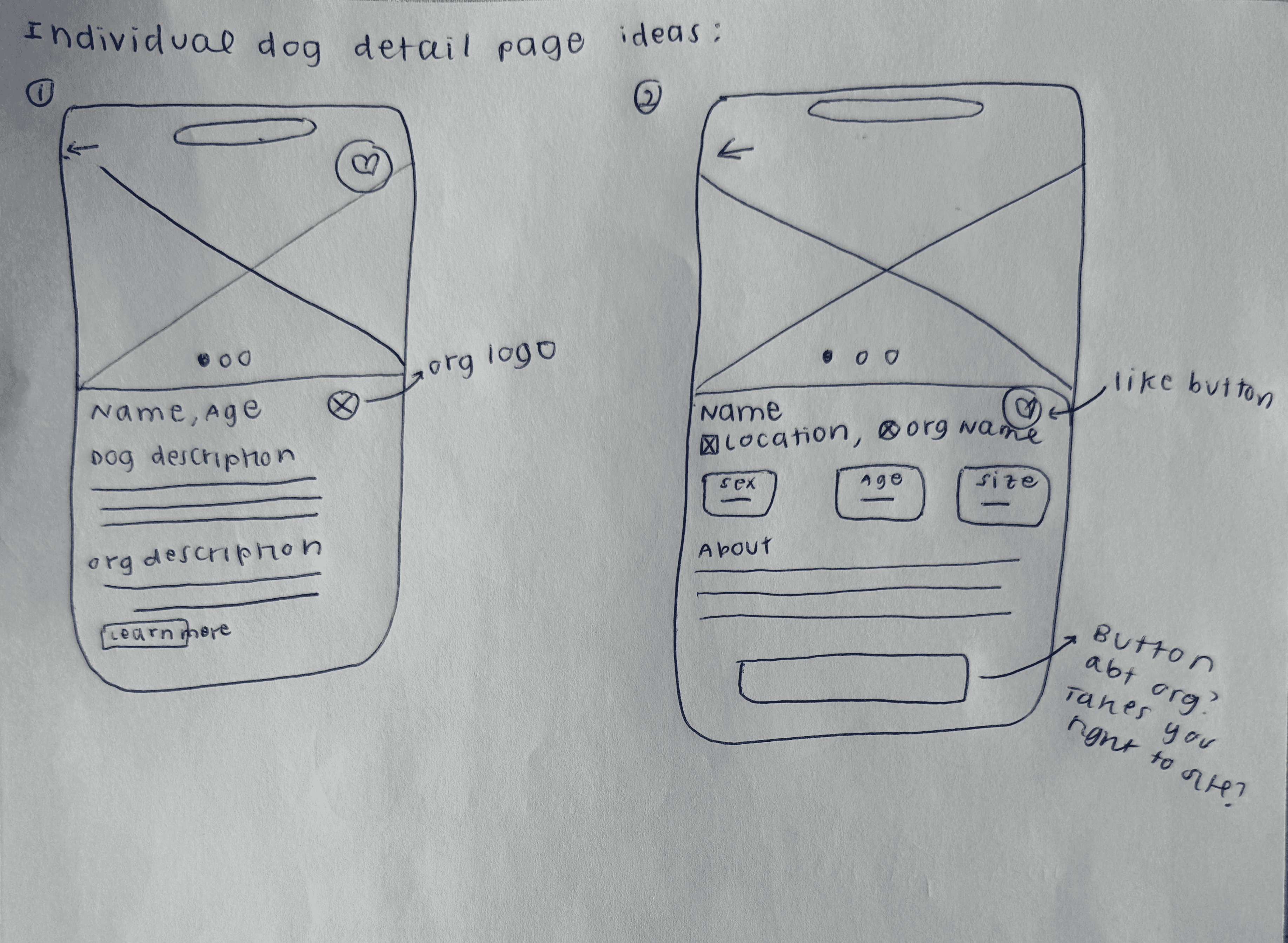
INDIVIDUAL PET DETAIL PAGE
I sketched two layouts and selected Design #2:
Better visual hierarchy with key info (name, location, org) at top · Dog traits shown as badges (sex, age, size) for quick scanning · Larger, more prominent action button on the bottom · Cleaner layout separates dog info from organization info

FAVORITES PAGE
Combines saved pets and organizations in one place:
Kept design consistent with browse feed design (same card layout) · Added pet info (sex, age) below the pet’s name to mirror the browse feed cards · Favorite button positioned consistently across all pages · Separated into two sections: ‘Pets’ and ‘Organizations’ for easy navigation
Lofi prototypes in figma
Translated selected wireframes into a static Figma prototype spanning 9 screens:
SECTION 4
Reflection
What worked: Starting with the user problem - not the screens - kept every design decision grounded in real user needs. Additionally, the task flow forced me to think through edge cases before picking up a pencil.
If I had more time: I would conduct interviews with real prospective adopters to validate or create accurate persona assumptions, run usability testing on the lo-fi prototype to identify friction in the browse flow, and explore high-fidelity designs focused on how to visually communicate organization verification.
More Projects


Adopt, don't scroll
Designing a centralized, trust-forward pet adoption mobile app for users overwhelmed by a fragmented landscape.
Adopt, Don't Scroll is a 7-day UX design challenge to create a mobile app helping first-time pet adopters find animals across multiple verified shelters and rescues in one place. Working solo from problem to prototype, I grounded every design decision in user research - developing a persona, mapping a full task flow, and iterating through paper wireframes before building a lo-fi prototype in Figma.
Overview
MY ROLE:
UX Designer (Solo)
METHODS:
Persona · Task Flow · Wireframing · Lo-fi Prototype
TOOLS:
Figma · Lucidchart · Paper
TIMELINE
Jan 30 - Feb 6, 2026
SECTION 1
PROBLEM
The pet adoption landscape is overwhelming - and fragmented.
When I started this challenge, I did what any user would do: Googled "dog adoption near me." Twenty websites loaded. Different organizations, different formats, no way to know which were legitimate.
There were dozens of different websites, each with their own pets to browse through. I didn't know where to start or which sites were even legitimate.
That experience was the research. The solution wasn't another shelter website - it was a centralized platform that aggregates listings, builds trust, and gets out of the user's way.
Primary Goal:
Search for adoptable pets across multiple legitimate adoption agencies/shelters in one place, without having to visit a dozen websites.
what this project means to me
My family adopted Marvin when I was 12 and he changed our lives. I believe in adoption because it gives animals a second chance while strengthening our communities. This project immediately stood out to me because more pets deserve homes, and I want to make the adoption process more straightforward.
SECTION 2
RESEARCH
Understanding the user
Before any design decisions were made, I grounded the work in user understanding. I developed a persona, identified core user needs, defined research questions, and documented key constraints and assumptions - all before a single screen was sketched.
Alex, the overwhelmed first-time adopter
"What if my perfect dog is on a site I didn't look at?"
Alex is a 31-year-old woman who recently settled into a stable living situation and finally feels ready to adopt a dog - but she's paralyzed by choice. She's Googled "dog adoption near me" and been met with 20+ different websites, each with their own listings and no clear way to know which organizations are legitimate. The last thing she wants is to waste time creating accounts on ten different platforms just to browse.
01
Centralized search
See pets from multiple sources at once
02
Trust indicators
Know which organizations are reputable
03
Efficient filtering
Search by breed, age, location across all sources
04
Source transparency
Clear path to contact the specific organization
SECTION 3
design process
Task flow - Mapping the journey before sketching a single screen
Before opening Figma, I mapped the full user flow in Lucidchart - every decision point, every branching path. The annotations below highlight the five design decisions that were baked into the structure from the start.
Key Design Decisions
Low barrier entry
Users can browse immediately without creating an account. Reducing friction at entry was deliberate - users shouldn't have to commit to browse pets.
Centralized feed
The browse feed pulls from multiple rescues and shelters simultaneously. One place instead of twenty - this is the core value proposition of the app.
User-controlled filtering
Users can filter by pet type, breed, age, size, and organization type at any point. The feed responds to their preferences, not the other way around.
Integrated education
First-time adopters often don't know what makes an organization legitimate. The resources section was created to build trust as part of the experience.
Clear path to action
The "Adopt Me" button takes users directly to the organization's website to begin the process. No middleman, no ambiguity about next steps - the app is a discovery tool, and it hands off cleanly.
Paper Wireframes
Explored 3–4 layout options per screen, documenting the rationale for every decision made:
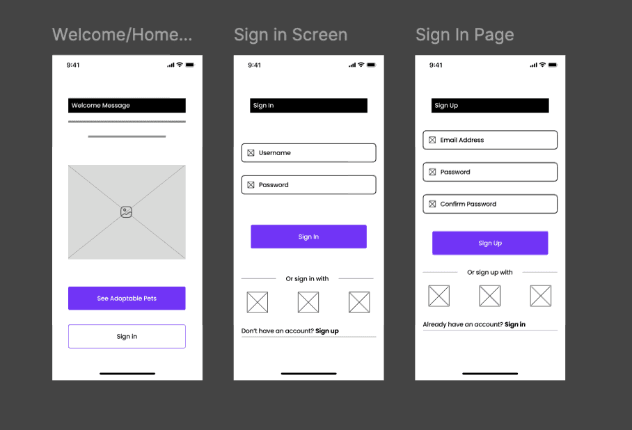
WELCOME/HOME SCREEN
I explored three different home screen layouts and selected the third design for the following reasons:
Two equally prominent buttons give users control over their path (browse vs sign in) · Larger, more accessible buttons improve usability
SIGN IN/SIGN UP SCREENS
I sketched standard sign-in and sign-up flows with:
Simple form fields (username/email, password) · Social sign-in/sign-up options for convenience · “Have an account? Sign in/Sign up” links for easy switching
USER PREFERENCE SCREEN
My first sketch asked: “How far would you travel?” in second drop down option as seen on the right. In my low fidelity prototype, I changed it to: “What types of organizations do you prefer?” Why I changed it:
Connects back to app’s main goal: searching multiple adoption sources · Lets users choose shelter, rescue, or foster networks (or combination of them) · Reminds users that the app searches across different adoption organizations
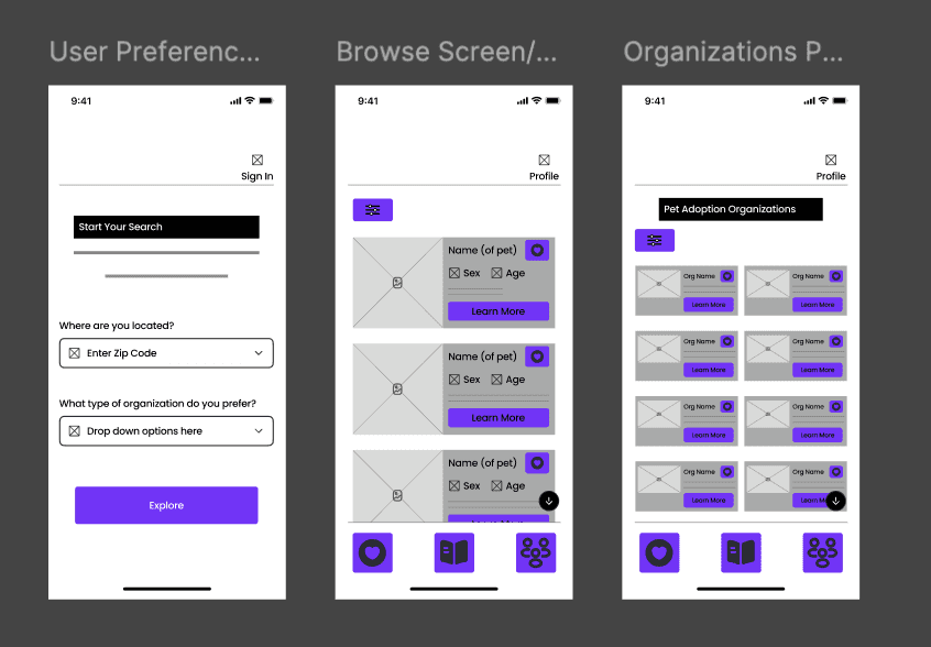
BROWSE SCREEN
I explored four different browse screens and selected Design #4 because:
Smaller cards show more pets per screen without scrolling· Users can quickly scan and compare multiple options · Large photos aren’t necessary - when users tap ‘Learn More’ button, the individual pet page shows full-size images · Bottom navigation established in this design: Favorites, Resources, Browse Organization
ORGANIZATIONS PAGE
I explored three layouts, and selected Design #3:
Added favorites button (users can save and compare orgs, just like with the pets) · Consistent with browse feed design (familiar pattern) · Users can revisit favorited organizations when deciding
RESOURCE PAGE
Selected Design #2 over Design #1 because it removed the header image and focused directly on the content. I also selected accordion style because:
Content is hidden until clicked, which prevents from information overload · Users can control what they read (not forced to scroll through everything) · Clean, scannable list of topics
INDIVIDUAL PET DETAIL PAGE
I sketched two layouts and selected Design #2:
Better visual hierarchy with key info (name, location, org) at top · Dog traits shown as badges (sex, age, size) for quick scanning · Larger, more prominent action button on the bottom · Cleaner layout separates dog info from organization info
FAVORITES PAGE
Combines saved pets and organizations in one place:
Kept design consistent with browse feed design (same card layout) · Added pet info (sex, age) below the pet’s name to mirror the browse feed cards · Favorite button positioned consistently across all pages · Separated into two sections: ‘Pets’ and ‘Organizations’ for easy navigation
Lofi prototypes in figma
Translated selected wireframes into a static Figma prototype spanning 9 screens:
SECTION 4
Reflection
What worked: Starting with the user problem - not the screens - kept every design decision grounded in real user needs. Additionally, the task flow forced me to think through edge cases before picking up a pencil.
If I had more time: I would conduct interviews with real prospective adopters to validate or create accurate persona assumptions, run usability testing on the lo-fi prototype to identify friction in the browse flow, and explore high-fidelity designs focused on how to visually communicate organization verification.
More Projects
Adopt, don't scroll
Designing a centralized, trust-forward pet adoption mobile app for users overwhelmed by a fragmented landscape.
Adopt, Don't Scroll is a 7-day UX design challenge to create a mobile app helping first-time pet adopters find animals across multiple verified shelters and rescues in one place. Working solo from problem to prototype, I grounded every design decision in user research - developing a persona, mapping a full task flow, and iterating through paper wireframes before building a lo-fi prototype in Figma.
Overview
MY ROLE:
UX Designer (Solo)
METHODS:
Persona · Task Flow · Wireframing · Lo-fi Prototype
TOOLS:
Figma · Lucidchart · Paper
TIMELINE
Jan 30 - Feb 6, 2026
SECTION 1
PROBLEM
The pet adoption landscape is overwhelming - and fragmented.
When I started this challenge, I did what any user would do: Googled "dog adoption near me." Twenty websites loaded. Different organizations, different formats, no way to know which were legitimate.
There were dozens of different websites, each with their own pets to browse through. I didn't know where to start or which sites were even legitimate.
That experience was the research. The solution wasn't another shelter website - it was a centralized platform that aggregates listings, builds trust, and gets out of the user's way.
Primary Goal:
Search for adoptable pets across multiple legitimate adoption agencies/shelters in one place, without having to visit a dozen websites.
what this project means to me
My family adopted Marvin when I was 12 and he changed our lives. I believe in adoption because it gives animals a second chance while strengthening our communities. This project immediately stood out to me because more pets deserve homes, and I want to make the adoption process more straightforward.
SECTION 2
RESEARCH
Understanding the user
Before any design decisions were made, I grounded the work in user understanding. I developed a persona, identified core user needs, defined research questions, and documented key constraints and assumptions - all before a single screen was sketched.
Alex, the overwhelmed first-time adopter
"What if my perfect dog is on a site I didn't look at?"
Alex is a 31-year-old woman who recently settled into a stable living situation and finally feels ready to adopt a dog - but she's paralyzed by choice. She's Googled "dog adoption near me" and been met with 20+ different websites, each with their own listings and no clear way to know which organizations are legitimate. The last thing she wants is to waste time creating accounts on ten different platforms just to browse.
01
Centralized search
See pets from multiple sources at once
02
Trust indicators
Know which organizations are reputable
03
Efficient filtering
Search by breed, age, location across all sources
04
Source transparency
Clear path to contact the specific organization
SECTION 3
design process
Task flow - Mapping the journey before sketching a single screen
Before opening Figma, I mapped the full user flow in Lucidchart - every decision point, every branching path. The annotations below highlight the five design decisions that were baked into the structure from the start.
Key Design Decisions
Low barrier entry
Users can browse immediately without creating an account. Reducing friction at entry was deliberate - users shouldn't have to commit to browse pets.
Centralized feed
The browse feed pulls from multiple rescues and shelters simultaneously. One place instead of twenty - this is the core value proposition of the app.
User-controlled filtering
Users can filter by pet type, breed, age, size, and organization type at any point. The feed responds to their preferences, not the other way around.
Integrated education
First-time adopters often don't know what makes an organization legitimate. The resources section was created to build trust as part of the experience.
Clear path to action
The "Adopt Me" button takes users directly to the organization's website to begin the process. No middleman, no ambiguity about next steps - the app is a discovery tool, and it hands off cleanly.
Paper Wireframes
Explored 3–4 layout options per screen, documenting the rationale for every decision made:
WELCOME/HOME SCREEN
I explored three different home screen layouts and selected the third design for the following reasons:
Two equally prominent buttons give users control over their path (browse vs sign in) · Larger, more accessible buttons improve usability
SIGN IN/SIGN UP SCREENS
I sketched standard sign-in and sign-up flows with:
Simple form fields (username/email, password) · Social sign-in/sign-up options for convenience · “Have an account? Sign in/Sign up” links for easy switching
USER PREFERENCE SCREEN
My first sketch asked: “How far would you travel?” in second drop down option as seen on the right. In my low fidelity prototype, I changed it to: “What types of organizations do you prefer?” Why I changed it:
Connects back to app’s main goal: searching multiple adoption sources · Lets users choose shelter, rescue, or foster networks (or combination of them) · Reminds users that the app searches across different adoption organizations
BROWSE SCREEN
I explored four different browse screens and selected Design #4 because:
Smaller cards show more pets per screen without scrolling· Users can quickly scan and compare multiple options · Large photos aren’t necessary - when users tap ‘Learn More’ button, the individual pet page shows full-size images · Bottom navigation established in this design: Favorites, Resources, Browse Organization
ORGANIZATIONS PAGE
I explored three layouts, and selected Design #3:
Added favorites button (users can save and compare orgs, just like with the pets) · Consistent with browse feed design (familiar pattern) · Users can revisit favorited organizations when deciding
RESOURCE PAGE
Selected Design #2 over Design #1 because it removed the header image and focused directly on the content. I also selected accordion style because:
Content is hidden until clicked, which prevents from information overload · Users can control what they read (not forced to scroll through everything) · Clean, scannable list of topics
INDIVIDUAL PET DETAIL PAGE
I sketched two layouts and selected Design #2:
Better visual hierarchy with key info (name, location, org) at top · Dog traits shown as badges (sex, age, size) for quick scanning · Larger, more prominent action button on the bottom · Cleaner layout separates dog info from organization info
FAVORITES PAGE
Combines saved pets and organizations in one place:
Kept design consistent with browse feed design (same card layout) · Added pet info (sex, age) below the pet’s name to mirror the browse feed cards · Favorite button positioned consistently across all pages · Separated into two sections: ‘Pets’ and ‘Organizations’ for easy navigation
Lofi prototypes in figma
Translated selected wireframes into a static Figma prototype spanning 9 screens:
SECTION 4
Reflection
What worked: Starting with the user problem - not the screens - kept every design decision grounded in real user needs. Additionally, the task flow forced me to think through edge cases before picking up a pencil.
If I had more time: I would conduct interviews with real prospective adopters to validate or create accurate persona assumptions, run usability testing on the lo-fi prototype to identify friction in the browse flow, and explore high-fidelity designs focused on how to visually communicate organization verification.